Samsung // Personalisation, Innovation & Optimisation
- Aug 25, 2020
- 2 min read
Updated: Oct 21, 2020
During my time at the design agency Cheil, I was part of a Personalisation Team and an Experimental Team. I worked on several projects that aimed to innovate new, sometimes radical, solutions for Samsung.com.
The Challenge
These Samsung projects were very granular, often tackling just one specific element. But they were also creative.
We didn’t have the time or resources to follow a long process but we did have remit to test new ideas and explore blue-sky thinking.
The Process
Although few of these solutions were implemented, they provided an opportunity for me to grow my creative muscles, and test out advanced interactions.
Rather than let these experiments sink without a trace, I’m keeping a few of them here for posterity – or at least until I run out of room in my portfolio and replace them with something really cool...
Samsung Note 10 Highlights Page
Problem
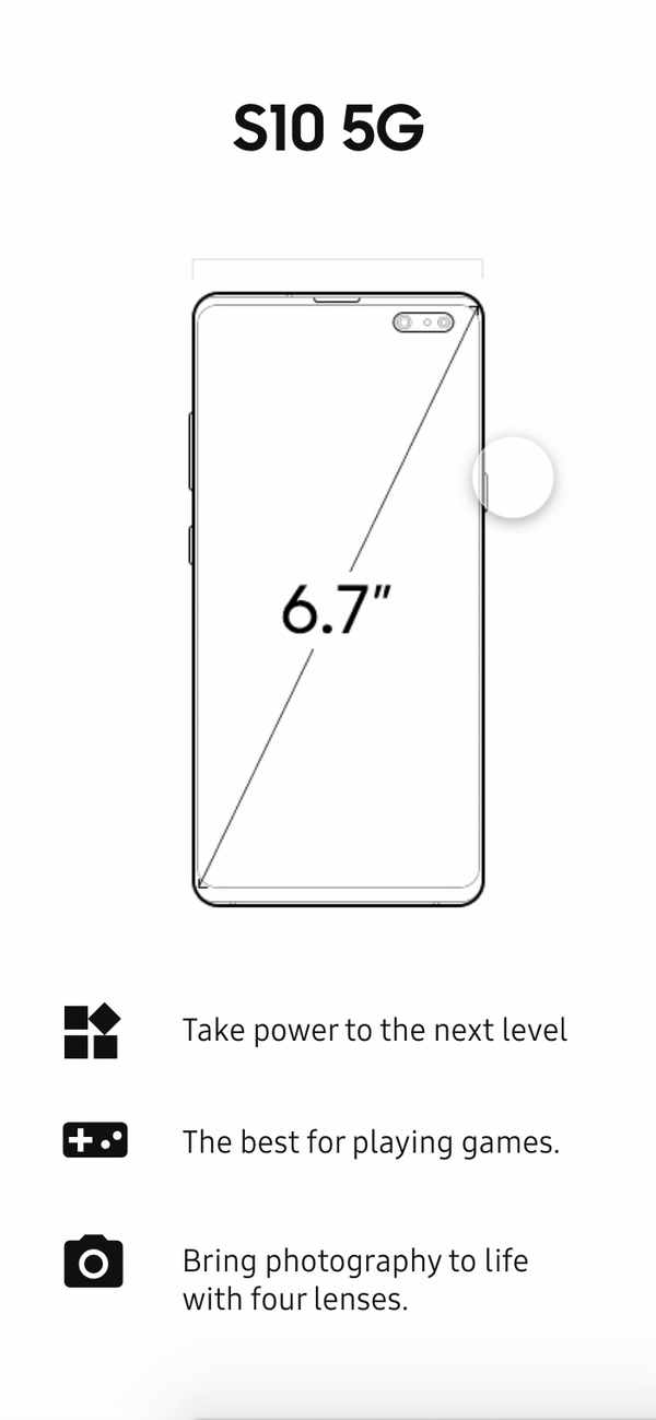
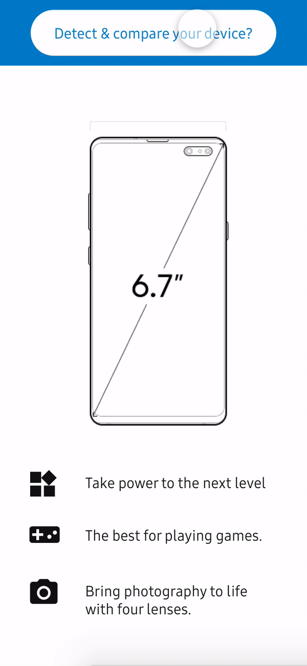
On release, the Note 10 was one of the most powerful phones ever made. The highlights page contained a wealth of information on the flagship device, but it was very long and information dense.
Research
I looked at heatmaps to see how people engaged with the page and its interactions.
The page featured multiple interactive components that got relatively high amounts of attention as measured by mouse move and clicks.
I also reviewed ~30 user interviews (a range of age, gender, and occupation) that we had conducted about device usage. Research showed users wanted:
Less technical jargon
More practical information
Easy access to key information
Key Findings about Phone Choice
The three most important features to our sample were:
Battery life (displayed as hours not mAh!)
Screen size
Camera


Solution
I proposed displaying the key stats at the top of the page and hiding most of the detailed information in accordion panels.
In addition, I prototyped several new interactive modules for users to play with.
The full version was ultimately rejected for reasons of budget and feasibility. Samsung did test a version of this page with key info moved to the top of the page, but this concept was not fully developed.
Series Selector
Samsung has several different phone types and multiple models within each series. I considered how these different series could be compared against each other and made several experimental prototypes
Mobile prototypes
Desktop Prototype
KX: Samsung Kings Cross
Samsung KX is a new immersive experience space at Kings Cross, London. Visitors can play with new and exciting tech like VR helmets and digital graffiti walls. The landing page did not reflect the dynamism of the space, and none of these features were advertised. They were simply listed on an ‘explore’ page. For a redesign pitch, I created a highly interactive landing page to show off the main attractions.

TV Help Me Choose Tool
The Samsung TV section is bewildering to many browsers. There is a large array of different models, each with different selling points.
There was already a ‘Help Me Choose’ tool, but it was not that useful or interactive. I created a wizard to help make the process easier.