Rowse Honey // Site Refresh
- Aug 30, 2020
- 2 min read
Updated: Oct 21, 2020
Rowse Honey condensed their range and made their branding more consistent. They wanted their website to display their products in a clear and minimal way.
Problem
There were two challenges: display the condensed range effectively, and emphasise the premium nature of the Manuka honeys.
Solution
I proposed an expanding card design, which allowed all the honeys to be shown, without taking up too much space. This also allowed the user to expand the cards and see detailed information about each honey without going onto a separate page for each product.
As this project required advanced prototyping, I made video clips of each interaction design, to show the client. Several clips are shown below.

User Flows
First of all, I mapped out how a user would progress through the current site, in order to understand the information architecture.


User Testing
Users expressed differing opinions about jars vs squeezy bottles:
“I really avoid plastic bottles.”
Users also expressed frustration navigating to the right info. Users wanted to find out about the honeys by clicking on the honey itself:
“You want to click on the pot! That’s natural behaviour, I really want to do that.”
Wireframes – Product Page
The first solution was to put all of the honeys on one single product page. I made the following changes to better display the condensed range:
a grid layout, to accommodate the extra products
smaller hero image, allowing some products to be seen above the fold
tabs for ‘jars’, ‘squeezy’ and ‘Manuka’


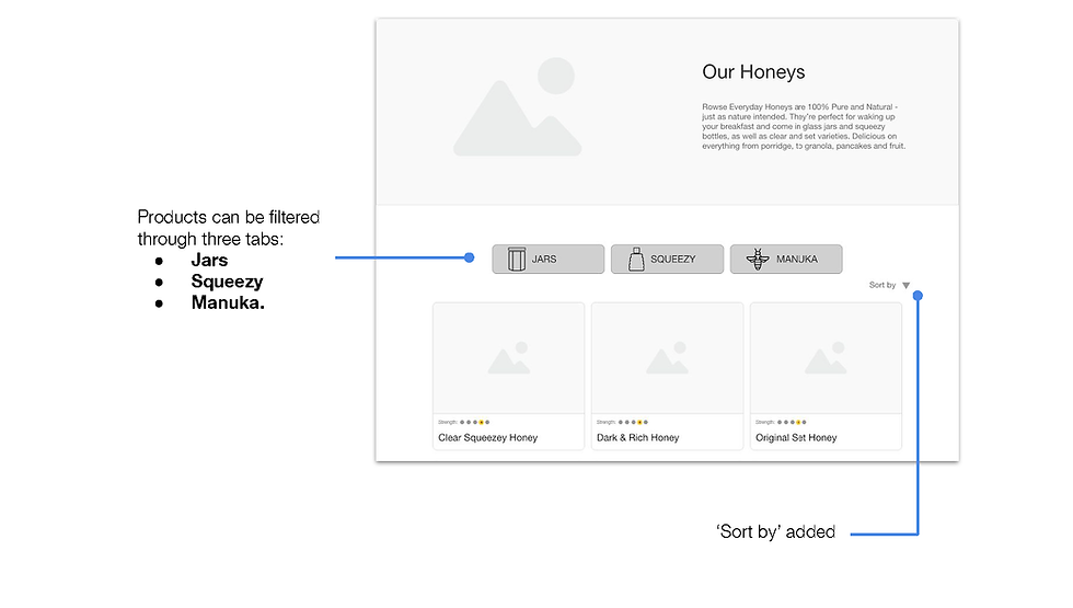
This simplified the site considerably, and reduced the height of the product page.
Manuka honey was not given enough importance, however, and users did not have much reason to spend longer on the Manuka range.
Wireframes – Product Info – Prototype
In the proposed design, the product info is hidden at first.
From user testing, I discovered that users expect to click on the honeys, so this is not a problem.
However, the information about each honey (description etc) still needs to be available.
We tested two different solutions:
New product description pages
Expanding product cards
These prototypes tested well, but the flashier option 2 won out. It was quicker and easier for users to navigate.
Option 1 – New Product Pages
Option 2 – Expanding Cards
Option 2 – Expanding Cards (Mobile)
Wireframes – Home Page
We spit up the categories and had a product page for ‘everyday honeys’ and another for ‘Manuka honeys’
This allowed Rowse to emphasise the premium nature of the Manuka range.
The second version of the home page went with two full-width strips, clearly separating the two ranges.

Final Prototypes
Everyday honey
This prototype shows:
Journey from home
Squeezy/Jar toggle
Product cards
The recipe carousel
Manuka honey range
This prototype shows:
Journey from home
Manuka Info page
Manuka Range
Results
A UI designer refined the final screens and created suitable icons.
All changes were accepted and Rowse honey updated their website.
Final screens are shown below:


